As a designer, it’s important to stay connected and involved in the industry. Staying relevant involves knowledge of current trends and top performers, and visiting the West Michigan Graphic Design Archives Exhibit by the 2022 graduating class of the Ferris Design program does just that. Getting the chance to look at recent and real-world examples of what design is doing in different forms and different environments helps me develop my own design sensitivities and ideas.
What’s In It For Me?
As a design student, I can very easily get wrapped up in the school aspect of my design education. Focusing on projects, deadlines, exams, and grades can cloud the focus on learning how to truly do excellent design. Without exposure outside of my narrow focus, my design solutions will start to stagnate and become outdated. Going to see the WMGDA archives gave me an opportunity to step out of that educational context and absorb good design in a refreshing and new environment. Not only was it nice to step outside of the classroom, but it was also nice to put my own knowledge to the test.
By trying to recognize names, techniques, and other elements that put my design competencies to the test, I was able to gauge where my industry awareness was at and identify both my advancements and shortcomings. In addition, I was exposed to well-designed solutions that gave me new methods and tools to execute future design solutions in projects in and out of an educational setting.
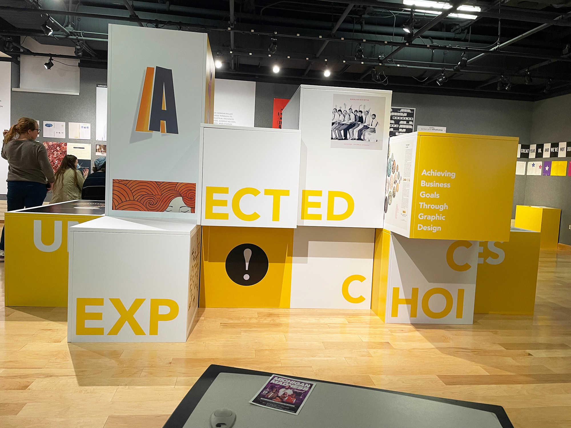
The Exhibit
Area 1: French Paper
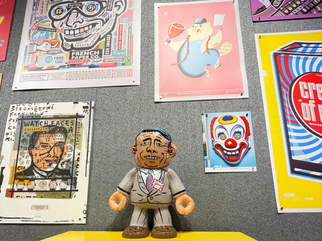
French Paper’s partnership with CSA Images is a testimony to quality substrate and materials paired with excellent design. French Paper, a company with a focus on authenticity, care, and love in their paper, has brought the value of using quality and proper material selection to the imagery company of CSA Images. By doing so, they have greatly improved the impact and awareness towards choosing substrates that not only portray care and quality in production, but also exemplify the printed composition.
Area 2: Opera
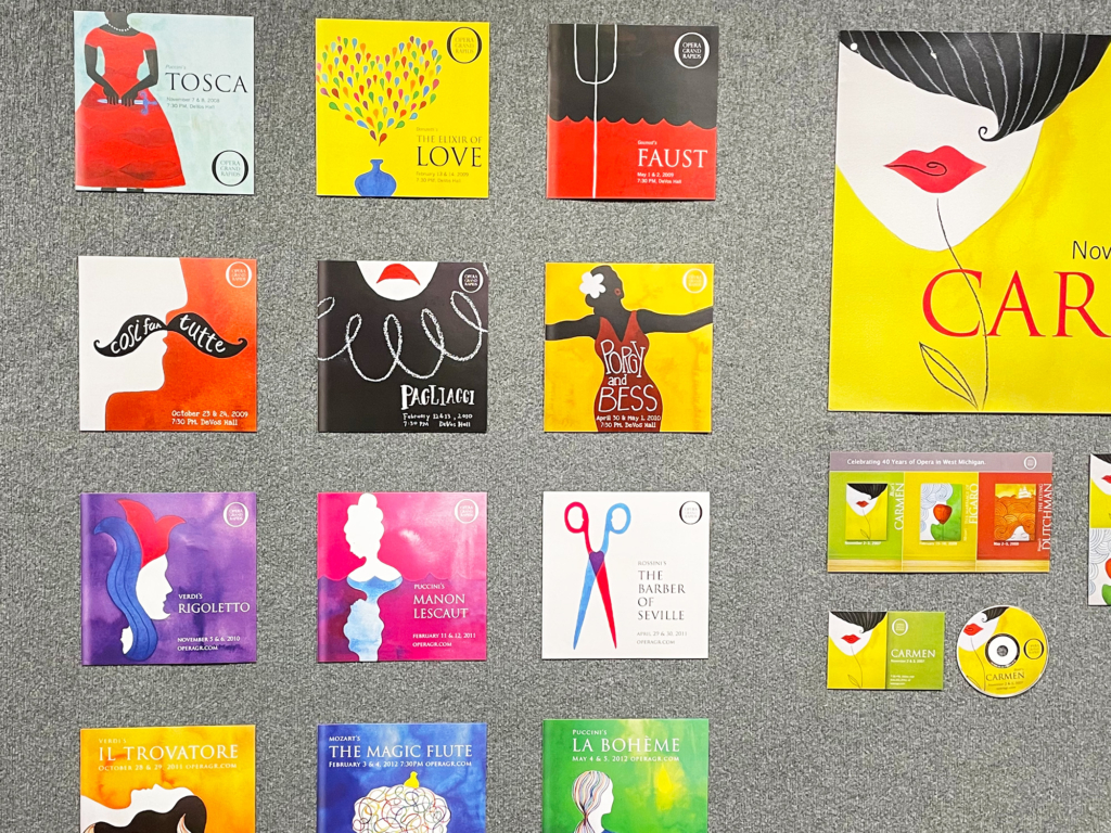
Working with the large variety of subjects and materials that Opera Grand Rapids, Square One Design had the task of creating a unique and uniform illustration style for their advertisement and branding of their operas. Such a task requires a large amount of versatility and understanding of breadth, and that is exactly what Square One Design managed to bring. The illustration style they developed has the ability to adapt to any subject matter while maintaining the unity of style and composition to still be identified as from Opera Grand Rapids.
All in all, I had a great experience visiting the exhibit. It was a great time to see design work outside the classroom in a more self-guided manner (as opposed to the more directed interactions I have during class). It inspired me to connect more with the industry and have a better grasp on the companies and trends that shape contemporary design.
References
https://graphicdesignarchives.org/
https://stage.moxiesozo.com/2016/10/11/charles-s-anderson/
https://www.squareonedesign.com/portfolio-item/opera-grand-rapids/